Web Accessibility, an example with Blazor
An introduction into the Web Accessibility world

In this article I am providing to you a very simple and practical introduction to Web Accessibility.
I will touch on the basics of this topic and also, provide links to additional material to elaborate on specific concepts.
My goal is to show that Accessibility is something for all the actors involved in the development of an application, not just the UI/UX experts. And it is not that hard!
For the practical part, together we will build something very common: a web form. We’ll do it using Blazor.
This article is also available in Italian here.
Introduction
Can you imagine a life with no Internet?
Many people rely on the global network for many things, some are very critical, others are just for entertainment purposes, like watching a movie or even, reading a book.
This variety of content is something that people can have access to, thanks to the web.
However, they are not all accessible.
The W3C, the organization that takes care of standards for the web says that a web content is accessible when people can:
- Perceive, understand, navigate, and interact with the Web
- Contribute to the Web
This is a fairly strong statement: it states that accessible contents can be accessed by everybody.
However it is almost impossible to build a web application or a product that is universally accessible, there will always be a scenario that cannot be covered. Furthermore, sometimes there is not enough budget to investigate specific accessibility situations. As well, there may be no need to gain wide accessibility because the application has to be used by a specific group of people with well established accessibility needs.
But, accessibility is a challenge that we all must embrace. We must build accessible products.
In a moment we’ll understand why this is important.
Thankfully, the W3C provides many guidelines to help with building accessible web applications, the Web Content Accessibility Guidelines (WCAG).
These guidelines define three levels of accessibility: A, AA, AAA.
A is the very first and minimal level and it is really not enough.
AA includes all the guidelines from the A level and adds some more important ones. This level is the de facto minimum required for all the websites. Indeed, many governments dictate that all the web contents must comply with WCAG version 2.1 and level AA.
AAA includes the guidelines from AA and, as well, adds some great value. It is as close as you can get to perfection if you follow the standard WCAG.
Why should we care about Accessibility?
It is still very common to think about accessibility as something that involves people that have some specific kind of disability, like blind or deaf people.
However, things are not that black and white, there are many shades of gray in between. Indeed, when we talk about visual disabilities we can be referring to blind people, people with reduced field of vision, blurred vision, impaired vision or many different situations.
The WHO states that 15% of the world's population (over 1 billion people) lives with some form of disability and this figure is growing.
There are also temporary disabilities that can happen to everyone.
Many of you have probably experienced the unpleasant situation of failing to read something on the smartphone screen in a very bright environment, like when you are outside and it’s too sunny.
As we age, we usually experience some sight-related problems. Also our lifestyle is not always very healthy, stress can make simple things quite difficult. For example, trying to understand the content of an article published on a website. If the web page is not well organized, it is sometimes impossible to get the most out of its content. Especially if you are tired or stressed. The user may give up or simply just move to another more properly structured website.
This can happen also when the language of the content is not the user’s first language.
Some websites may include the option to switch to another language. However, it is quite difficult to cover all possibilities.
If the page is well organized and the text is written with a plain language, the user will more than likely grasp the content, even if it is not in his/her first language. This can also make effective the use of automatic translation services.
Of course this does not apply to all kinds of content, there are some exceptions, like scientific material that has to be used by experts or people that are supposed to have a specific background knowledge on the topic.
Keep in mind that an accessible website is usually easier to use, compared to a website that is not accessible.
Also, consider that accessible websites are easier to scrape and understand so they have better SEO performances.
Last but not least, some countries have accessibility requirements. Make sure that your content is complying with at least WCAG 2.0 and verify the guidelines from the government of where your website is used.
A practical example
Let’s take a look at how to approach Web Accessibility with a practical example. We are going to build a web form, using Blazor as our UI framework of choice.
Our guide in this process is the example for the creation of a web form, provided by the W3C.
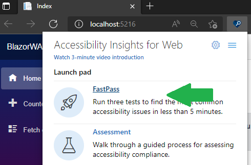
A very useful tool to check if our pages have some accessibility problem is Accessibility Insights, a web extension available for many web browsers.
We start by creating the project for the website using the .NET CLI
dotnet new blazorwasm -–name BlazorWAI
I am naming our project BlazorWAI after the Web Accessibility Initiative, the division of the W3C that works on all that regards Web Accessibility.
In the command line, switch to the application’ folder and run the application with this command:
dotnet run
You should be able to see the Blazor’s default template
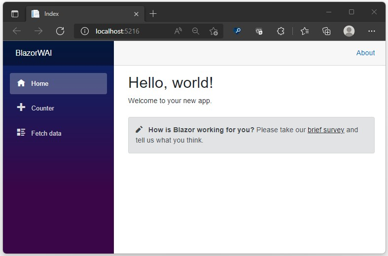
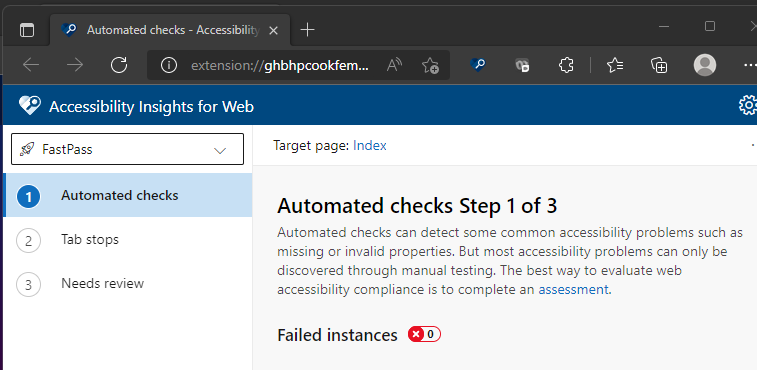
Use Accessibility Insights to check if this page has any accessibility issues, running a Fast Pass.
Great, there is no accessibility issue!
We start now implementing the web form, in this we try to properly use semantic tags.
This is because accessibility tools like screen readers leverages on them to interpret the content of the page and navigate it.
Likewise, SEO scripts do something similar to understand the structure of the page.
A very trivial check that I like to do when I visit a website is to navigate it using the keyboard. Basically, just jumping from an element to the next with the TAB key and with SHIFT + TAB to move to the previous element. If I manage to touch all the elements that are supposed to be touched and I have a positive experience without having to use the mouse, the website’s developers made a proper use of semantic tags.
The form that we are going to build is a very standard one to collect the shipping information of a client. There will be two sections: one for the user’s contact information and one for the shipping information.
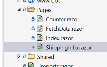
Add a ShippingInfo.razor page to the Pages folder
At the beginning of the file, add the @page directive to specify the navigation route
@page "/shipping"
Add the link to this page to the navigation menu (NavMenu.razor)
...
</li>
<li class="nav-item px-3">
    <NavLink class="nav-link" href="shipping">
        <span class="oi oi-list-rich" aria-hidden="true"></span> Shipping
    </NavLink>
</li>
...
Now, back in the ShippingInfo.razor file. We add the code for the model.
@code {
public class ShippingInfoModel
    {
        // User Info
        [Required]
        public string? FirstName { get; set; }
        [Required]
        public string? LastName { get; set; }
        [Required, EmailAddress]
        public string? Email { get; set; }
        [Required, Phone]
        public string? Phone { get; set; }

        // Shipment Info
        [Required]
        public string? Name { get; set; }
        [Required]
        public string? Street { get; set; }
        [Required]
        public string? City { get; set; }
        [Required]
        public string? PostalCode { get; set; }
        [Required]
        public string? Country { get; set; }
    }
}
Yes, I know, it is not ideal to put this code in the razor component and also its structure may look bad, however it helps me to keep things simple. Refactoring is up to you.
I also put some Data Annotations that will be helpful later, when discussing the form validation.
Add some more code
@code {
    ShippingInfoModel model = new();
    private EditContext shippingInfoEditContext;

    protected override void OnInitialized()
    {
        shippingInfoEditContext = new(model);
    }
Here we create an instance of the model to pass to the EditContext’s constructor, that is how ASPNET tracks all the changes that happen in the model and handles validation.
Let’s start giving some structure to the form:
<EditForm EditContext="shippingInfoEditContext">
    <fieldset>
        <legend>User Info</legend>
    </fieldset>
    <fieldset>
        <legend>Shipping Info</legend>
    </fieldset>
</EditForm>
The EditForm tag will take care of writing the HTML form tag with the proper configuration to deal with the edit context that we set as property.
As you can see, I use the fieldset tag to delimit the two sections of the form, the first is for the User Info and the second is for the Shipping Info. This will help assistive technologies in providing the user with some context while navigating the page.
This form is very basic, however in real life, forms can be quite long. Grouping the input field with fieldsets can improve the organization of the page.
We add now our first input field
    <div class="form-group">

        <label for="inputFirstName">
                   First Name
        </label>

        <InputText id="inputFirstName"
                   class="form-control"
                   placeholder="Enter First Name"
                   @bind-Value="model.FirstName"
                   DisplayName="First Name"
                   />

        <ValidationMessage
                   For="() => model.FirstName"
                   role="alert"
                   />

    </div>
There is a div that contains:
- label: describes the input field that it references using the for attribute. It tells the user, directly or via the assistive technology, that this is the input field for the First Name. For more samples or ideas, check the Labeling section in the WAI tutorial.
- InputText: is the ASPNET control that is bound to the field FirstName in the model’s instance.
- ValidationMessage: shows the error message to inform that the data provided for the FirstName is not valid. As you can see, the For property is set to reference the specific field in the model. The attribute role with value alert is there because, when the error message is visible, I want to alert the assistive technology to inform the user of the problem with the field.
Because we are using the DataAnnotations in the model, we are already providing some validation rules. We just need to tell Blazor to use them when it is validating the form.
<EditForm EditContext="shippingInfoEditContext">
    <DataAnnotationsValidator />

    <ValidationSummary />
I also added the ValidationSummary to show the entire list of validation problems. It is a good practice to place it at the very beginning of the form.
Before running our web app we just need to add the button that will trigger the submit of the form.
    <div class="row">
        <button
             type="submit"
             class="btn btn-primary">
             Submit
        </button>
    </div>
</EditForm>
Now, running the project and submitting the form, without filling in any data, we have this message
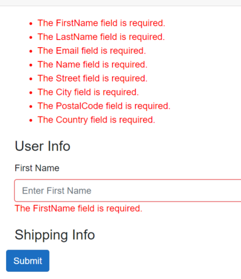
The validation is working. It is also reporting that not only the First Name is missing, but the entire model is empty, this is because we put the Required attribute on all the fields of the model.
You can add the code for the Last Name on your own. We focus now on the Email address
<div class="form-group">

    <label for="inputEmail">Email address</label>

    <div class="input-group ">

        <div class="input-group-prepend" aria-hidden="true">
            <span class="input-group-text">@@</span>
         </div>

         <InputText id="inputEmail"
                    type="email"
                    class="form-control"
                    aria-describedby="emailHelp"
                    placeholder="Enter email"
                    @bind-Value="model.Email"
                    DisplayName="Email"
                    />
         </div>

         <ValidationMessage For="() => model.Email" role="alert" />

         <small id="emailHelp" class="form-text text-muted">
              We'll never share your email with anyone else.
          </small>

</div>
If compared to the previous fields, in this code there is something new:
- There is a div with css class input-group-prepend that shows the @ symbol right before the input for the email address. This has the attribute aria-hidden set to true to tell the assistive technology to ignore this element. Indeed, it is useful to show the @ symbol only if the user can actually see it on the screen, it does not provide any useful information to a screen reader user. This applies also to all the decorative elements.
- There is a small tag that is used to provide the user with more information on the specific input field. This is bound via id to the aria-describedby attribute in the InputText element. Here we are just telling the user that the website will not share the email address with other entities but it can also be used to provide the user with some info on how to fill in the specific field.
Now we can complete coding the entire form. At the end we’ll have something similar to the code in this sample
We can run the application and see that if we try to navigate the form with the keyboard (using TAB to move forward and SHIFT + TAB to move backward), we can reach each input field and we can also submit the form.
It wasn’t very difficult, we just used the default Blazor template that uses Bootstrap for the styling.
Let’s check if Accessibility Insights find some accessibility problem, we run a Fast Pass.
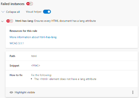
The extension found a problem, the language attribute of the page is not set and this violates the WCAG 3.1.1 rule.
It is very important to set the language attribute, especially if your page has some text in it. This is because screen readers can use a different accent based on its value or they'll use the default language accent.
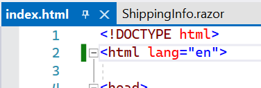
In our app, in the index.html file, we set the attribute lang=”en” in the html tag, to say that our page’s content is in English.
We now go back to our application and we try to submit an empty form so that it displays all the validation messages and then we run Accessibility Insights again.
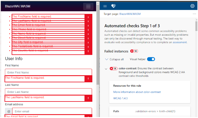
There is a problem with the red color of the messages: the contrast ratio with the background (white) is not enough, it should be at least 4.85:1. Accessibility Insights already suggest to use a color with the proper contrast ratio (#e50000).
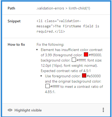
In the app.css file we change the color for the validation-message class.
.validation-message {
    color: #e50000;
}
Now everything should be fine and Accessibility Insights should not report any other issue.
Conclusions
After reading this article you might be thinking “well, it’s not difficult to build accessible web applications”.
Indeed, but we took particular care at:
- structure of the page
- semantic tags
- W3C guidelines (WCAG)
- test: use browser’s extension to check if we missed something and also try navigating the page using only the keyboard, do the same thing but turn on the screen reader.
However, this is just a starting point, an attempt to demystify accessibility and make it more developer friendly.
Remember that it is not just for UI/UX experts, it is part of the entire process of bringing to life our apps and making them grow healthy.
Here are some ideas on how to improve our web form.
If you try it on a mobile device, you’ll have to do some vertical scrolling to fill it in.
What happens if you reach the submit button but you forgot to provide a field that is at the beginning of the form? You will notice that there is a problem with some fields because the form is not submitting. But which field? You have to scroll up to find it.
If you can use the mouse it’s not a problem. However, we should do better: we should move the focus to the first invalid field, so that there will be no need for any scrolling.
In Blazor this can be achieved using JavaScript Interop and performing a Scroll Into View of the first invalid element.
Here is an example built with Blazor.
If you are building a complex web form, with many fields, you should break it down in sections and consider of splitting it into multiple pages.
Here is an example built with Blazor.
If you are considering using some third party component library…
There are some great products that are built with Blazor, some are free, for others you have to buy a license.
Be careful, sometimes they may have some accessibility issues.
Telerik UI for Blazor should have a good WCAG support. Open source libraries usually have GitHub issues that can help you in understanding their support.
At the end of the day, you should always do some checks yourself. Accessibility Insights is a great tool to help with this job.
There is no silver bullet third party library, you have to consider your use case and check the available options.
Additional Resources:


